In Search of a Japanese Microbrand’s Soul
I landed in Japan with a plan that felt simple and almost ritualistic. I was finally going to see KUOE in person, walk into their Kyoto store, and walk out with the SOMBRERO 90-011 I’d been thinking about for months—the green linen dial, the one that just felt right the moment I saw it online.
KUOE had been one of those brands I quietly followed for a while. Not massive, not overexposed—just a small Kyoto-based watchmaker doing something very intentional with vintage design. There’s something about that kind of brand that pulls you in. It doesn’t feel like you’re buying a product; it feels like you’re discovering something.
Then, literally a day before my flight, everything changed.
Scrolling YouTube the night before departure, I came across KUOE’s latest release video. Close-up shots of a dial being painted by hand—layer after layer—using something called Urushi lacquer. It had this depth to it that didn’t look like anything I’d seen before. Not glossy in a cheap way, but almost alive. The kind of finish that catches light differently every time you turn your wrist.

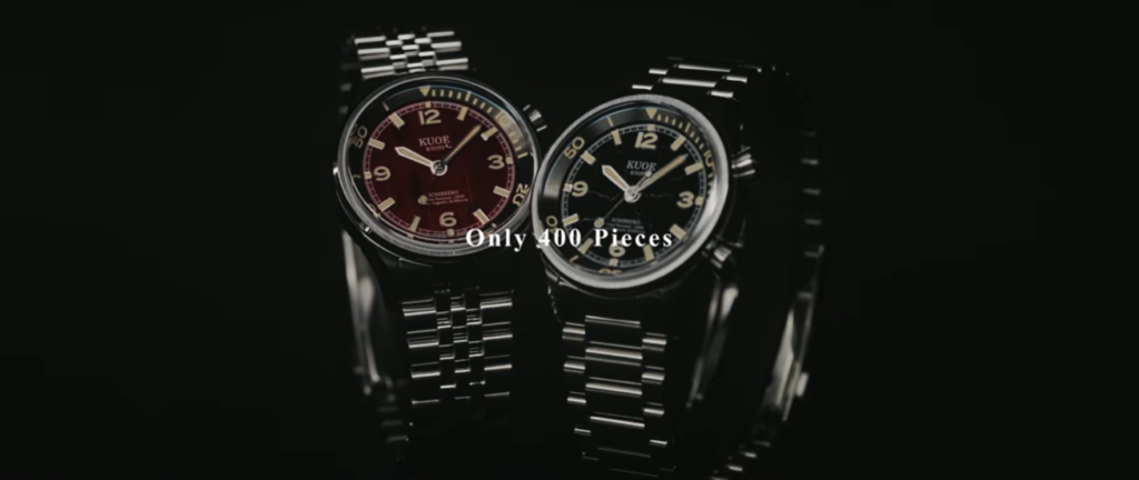
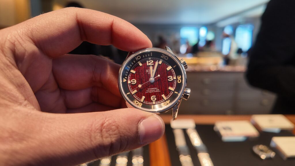
I’d seen Urushi once before on a Seiko Presage, but that was a polished black dial, more traditional, more reserved. KUOE was doing something different. They had two versions: a black dial with this cracked, almost fractured texture, and a red dial with visible brushstrokes—each one slightly different because they’re all done by hand.
And they were releasing it as a limited edition. 200 pieces of each.
Suddenly, the trip wasn’t just about Kyoto anymore.
By the time I got on the plane, I was already rethinking everything. Do I stick to the original plan and get the green dial I know I love? Or do I pivot and go to Tokyo for this new release? By the time we landed, I had convinced myself that I’d go to the Omotesando store and just see what happens. I wasn’t going to force it. If the watches were gone, they were gone.
The day of the release didn’t exactly go in my favor. I had a street food tour booked in Asakusa that I wasn’t about to cancel, so while everyone else was probably lining up at 11 AM, I was eating my way through Tokyo until mid-afternoon. It was raining too—the kind of steady rain that makes you wonder if you timed everything wrong.
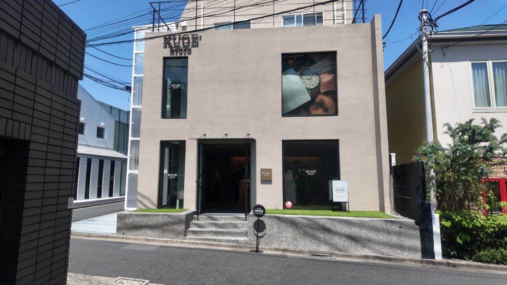
We finally made it over to Omotesando around 3 PM, and I was fully expecting to walk into a sold-out situation.
But there was no line. No rush. Just a clean, quiet storefront and a handful of people inside.
I remember looking at my wife like, “No way.”
I asked one of the attendants if they still had the limited edition pieces, and he just smiled and said yes. Not barely. Not a few. It sounded like there were still plenty left. That surprised me, but it also gave me room to breathe.
The in-store experience was genuinely great. The staff didn’t rush anything. The GM spent time walking me through the watch—explaining the movement, the inner bezel, the dual crown design. You could tell he actually cared about the details, not just making the sale. That kind of interaction sticks with you, especially when you’re visiting from the other side of the world.
When I finally got the watches in hand, though, I had a moment.
They didn’t immediately blow me away.
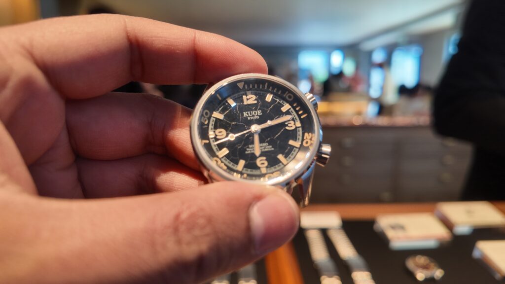
The black dial, while interesting, felt a bit overworked for my taste. The cracked texture caught too much light in a way that made it feel busy. The red dial, on the other hand, was bold—definitely more my style—but also more experimental than I expected. Up close, it had this slightly glittery quality, and depending on the angle, you’d notice little variations in the lacquer that make every piece different.
It was at that moment I realized something important: I wasn’t just evaluating the watch. I was also reacting to the idea of it being limited.
And that’s a dangerous place to be as a buyer.
There were also a few small friction points that pulled me back to reality. I needed my physical passport to get the tax discount, which I didn’t have on me. There was an extra fee to size the bracelet. And since each dial is unique, you don’t really get to pick your favorite—you get what’s handed to you.
All of that was enough for me to pause. I asked them to hold the watch, and to their credit, they were completely accommodating. No pressure, no attitude—just a simple “come back tomorrow.”
That night, I went back and forth more than I’d like to admit. I even sent photos to family and friends to get their takes. Some loved it, some didn’t. I read more online comments than I should have. The usual mix—people praising the craftsmanship, others questioning the design or the price.
In the middle of all that noise, I went back to the original question: what did I actually want?
The honest answer was that I came to Japan for that green dial. But somewhere along the way, this trip had become about more than just buying a watch. It became about the experience of being there, in that moment, with access to something tied so closely to Japanese craftsmanship.
The next day, we went back to the store. This time, I asked to see both options side by side again—the green and the limited red.
The green was exactly what I remembered. Clean, balanced, easy to wear. The safe choice.
The red was still imperfect in the same ways… but it felt different now. It had character. It had a story built into the dial itself. You could see the handwork in a way that doesn’t come across in photos.
That’s when the decision became clear.
I went with the red Urushi dial.
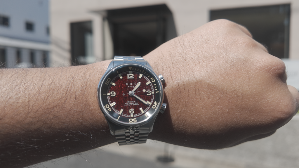
Not because it was perfect, but because it felt like something I could only really connect with by being there. Something I could bring back and actually talk about—not just as a watch, but as an experience.
The checkout process was smooth, and the team continued to be fantastic. They even added a travel case, which I’ve already gotten a lot of use out of. Small gesture, but it goes a long way.
Since then, I’ve spent more time with the watch, and I’ll be honest—it has both strengths and quirks. The way the light plays off the dial is incredible, but that same texture can sometimes affect readability. It’s not always a clean glance like a standard dial would be. And depending on lighting, you might catch reflections that make the surface feel busier than expected.
But those are trade-offs that come with something like this.
Looking back, I think KUOE is doing something interesting. They’re a small brand trying to find their balance between classic design and more artistic expression. Releases like this feel like part of that process. Not everything is going to land perfectly for everyone, but you can see the direction they’re exploring.
And that’s part of what makes them worth paying attention to.
If you’re ever in Tokyo, I’d genuinely recommend stopping by the Omotesando store. Even if you don’t end up buying anything, it’s worth seeing how they present their watches and how they think about what they’re building as a brand.
As for me, I didn’t leave Japan with the watch I originally planned to buy.
But I left with one I’ll probably remember more.


